- Music Marketing Trends by Jesse Cannon
- Posts
- Lazy musicians ALWAYS overlook this
Lazy musicians ALWAYS overlook this
A Masterclass on YouTube Thumbnails For Musicians
Jesse Cannon
June 12, 2025
Music Marketing Trends is a Newsletter by Jesse Cannon that breaks down how musicians really get their music heard. If you know a story we should be telling or an artist we should cover just hit reply to this email.
Our Culture, Clarified—Every Week

Every week, 1440 hands knowledge-seekers a guided tour through a single social current. We stitch together history, data, and expert voices so you don’t just witness change—you understand it. One concise, fact-first read turns surface headlines into the deeper “why” that satisfies your curiosity and keeps your worldview expanding.
YouTube Thumbnails are one of the hidden details that help get listeners in from one of the most popular music discovery engines. A lot of you see a good thumbnail from your favorite creator and think, "That's cool, but I'm not doing all that work. I'll just use my album cover or something simple." But when you're someone like me who focuses heavily on this stuff, your thumbnail quality - how clean, professional, and on-genre it looks - really matters for getting views.
Good vs. Bad Designs
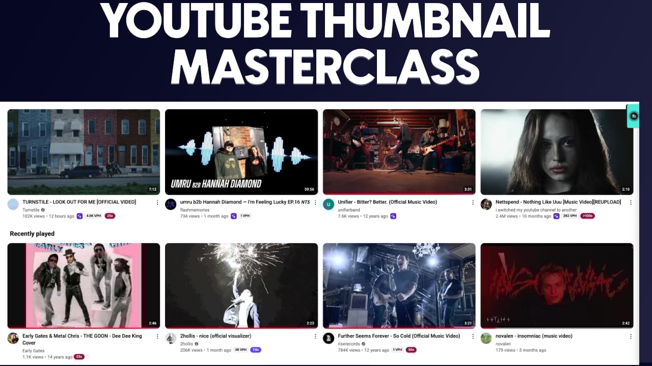
The design quality and avoiding design mistakes make a big difference in whether people click or not. As shown in the example below, the text appears to be poorly formatted. That's going to hurt your views, which is why this video has so few.
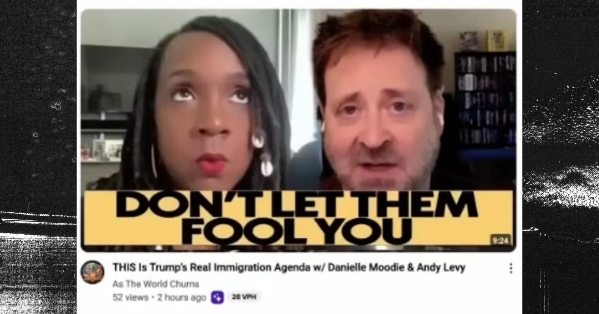
Example of a poor thumbnail design
What really matters in getting music clicks is that people see the quality of the music or recognize their niche culture. A lot of this is making people feel like they're part of what you do.
Good examples: 2Hollis uses very striking visuals. Caroline Polachek has a striking image. Turnstile - if you're into them, you recognize that concert backdrop aesthetic. gabby start looks like hyperpop. "Cyberpunk 2020" clearly signals that this is for you if you're into cyberpunk. Mark Rebillet puts his recognizable face there, but in different situations. bbno$ in a club setting tells you it's a dance anthem. Illusion Hills looks artsy like Brockhampton, so you know it's that creative hip-hop style.
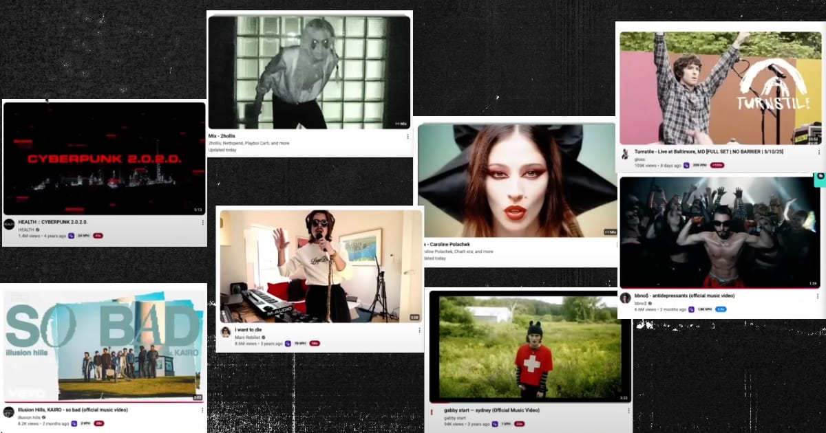
Examples of good thumbnails
You get the point - thumbnails need to instantly communicate your genre and quality to attract the right audience.
Does it Look Like Your Genre?
But the big thing with a song is artist curiosity, cultural connection, and whether the graphic design style matches what people expect.
The title matters less for music than it does for my videos, where the title drives everything. With songs, it's whether somebody wants to listen or not. So, we need to focus on creating something that looks like what people want to see from your genre.
A/B/C Testing
Subscribe to Premium Subscription to read the rest.
Become a paying subscriber of Premium Subscription to get access to this post and other subscriber-only content.
Already a paying subscriber? Sign In.
A subscription gets you:
- • Read Paywalled Content
- • View Full Artist Dissections
- • View Album Rollout Breakdowns & Recaps In Full
- • Ask Lecturers Questions
- • Access To Full Unabridged Podcast Episodes
- • Discord Access
Reply